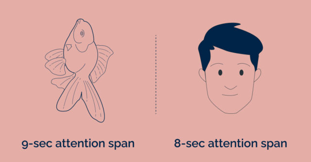
It’s official, goldfish have a better attention span than humans! In an era where there is an abundance of content available at our disposal, humans are less and less tolerant of poorly designed product experiences. They are easily frustrated and quit at the first sign of ambiguity or unclear intent.
It is therefore becoming increasingly important to communicate messages clearly and quickly. To successfully cater to the evolving needs of users, it is crucial to have a deep understanding of user behaviour and preferences when designing these systems.
This blog explores the impact of shorter attention spans, and provides valuable insights on designing systems that effectively communicate and satisfy user expectations.

The Impact of Shorter Attention Spans
The rise of shorter attention spans among users has profound implications for product design and user experience.
-
The Challenge of Capturing User Attention
With an abundance of content available at our fingertips, users have developed a limited tolerance for poorly designed products. They are quick to become frustrated and easily give up on products that fail to meet their expectations. This presents a significant challenge for designers and developers who need to create experiences that engage users from the first interaction.
It’s a startling fact that goldfish have been found to have longer attention spans than humans. While goldfish have an average attention span of about 9 seconds, studies suggest that the average human attention span has decreased to around 8 seconds. This means that designers have an incredibly narrow window of opportunity to capture and hold users’ attention before they move on to something else.
-
Drastic Consequences of Poorly Designed Products
In a world where users have countless options and alternatives, a poorly designed product can have severe consequences. Users expect clarity, simplicity, and ease of use. If a product fails to meet these expectations, users will quickly abandon it in favour of alternatives that offer a more engaging and seamless experience. This not only leads to lost opportunities but also damages the reputation and credibility of the product and the brand behind it.
-
The Need for Instant Clarity and Intent
To combat the challenges posed by shorter attention spans, it is essential to design systems that effectively convey the intended message in a clear and concise manner. Users should be able to understand the purpose and value of a product or service quickly. Designers must strive to eliminate any ambiguity or confusion that may cause users to lose interest or become frustrated.
UX Design Strategies for Captivating User Experiences
By understanding user behaviour and preferences, we can create experiences that captivate and engage users, ultimately leading to better outcomes for both users and businesses. Here are some tips that can help you design systems that cater to our newly enhanced attention spans:
-
Keep it Concise
Keep the content concise and to the point. Use short sentences and paragraphs, bullet points, and headings to break up the content into digestible chunks.
-
Use Visuals
Incorporate visuals such as images, videos, and infographics to break up the text and make the content more engaging. Visuals can help users retain information and make it easier to understand complex topics.
-
Provide Instant Gratification
Design systems that provide immediate feedback and results. Use progress bars, notifications, and real-time updates to keep users engaged and motivated.
-
Simplify the User Interface (UI)
Make the user interface simple and easy to navigate. Use clear and concise labels and minimise the number of clicks required to complete a task. Users are more likely to abandon a task if it takes too long or requires too much effort.
-
Personalise the Experience
Personalise the experience by using data and user preferences to tailor the content and recommendations to their needs. Personalisation can increase engagement and make users feel more invested in the system.
-
Design for Mobile
Mobile devices have smaller screens and limited attention spans, so design systems that are optimised for mobile devices. Use responsive design and prioritise content that is most important for mobile users.
-
Prioritise Content
Prioritise the most important content and make it easy for users to find. Users with shorter attention spans tend to scan content quickly, so make sure the most important information is easy to locate.
-
Use Gamification
Gamification can help keep users engaged and motivated. Use gamification techniques such as badges, points, and leaderboards to make the experience more fun and rewarding.
Lastly, remember what’s important is to create systems that keep users engaged and motivated. Once you have ‘hooked’ (pardon the pun 😛) the user with all relevant and concise content, there’s a real chance that the user will give you their attention for your product to prove its mettle.
In a world where attention is a scarce resource, understanding the UX principles behind shorter attention spans is essential for creating successful digital experiences. By implementing the tips and strategies discussed in this blog, designers can effectively capture user attention, deliver concise and engaging content, and foster lasting connections with their audience. Remember, the key to success lies in designing systems that keep users engaged, satisfied, and eager to explore all that your product has to offer.
If you’re looking to enhance your UX design to cater to shorter attention spans, we can help. Contact us today to discuss how we can create engaging experiences for your target audience.
